
Notebook 24: Causality and Fairness#
BINF 4002 — Machine Learning for Health | Lecture 24 Companion
Overview#
This notebook covers two tightly connected topics:
Fairness in health AI — The impossibility theorem, the Obermeyer et al. (2019) case study, subgroup evaluation, and mitigation strategies.
Causal inference — DAGs, confounders vs. mediators vs. colliders, propensity score methods, and the causal roots of algorithmic bias.
Data sources:
MEPS (Medical Expenditure Panel Survey) via AIF360 — real healthcare utilization data with demographics
Obermeyer synthpop — synthetic data replicating the racial bias in a commercial health algorithm
NHEFS (National Health and Nutrition Examination Survey Follow-up Study) via
causaldata— real data from Hernan & Robins’ Causal Inference textbook for collider bias and propensity score demosSimulated data — for the DAG patterns demo only (requires known causal structure)
All figures save to figures/ for use in lecture slides.
# (pip install handled by the book's isolated env)
## SETUP
import numpy as np
import pandas as pd
import matplotlib.pyplot as plt
import matplotlib.gridspec as gridspec
import seaborn as sns
import warnings
import os
warnings.filterwarnings("ignore")

from sklearn.linear_model import LogisticRegression, LinearRegression
from sklearn.ensemble import GradientBoostingClassifier
from sklearn.model_selection import StratifiedKFold
from sklearn.metrics import (roc_auc_score, recall_score, precision_score,
                             confusion_matrix, roc_curve)
from sklearn.preprocessing import StandardScaler

os.makedirs("figures", exist_ok=True)

sns.set_style("whitegrid")
PALETTE = sns.color_palette("colorblind")
COL_BLUE = "#1D4F91"
COL_ACCENT = "#D2492A"
COL_GREEN = "#2E8B57"
COL_GRAY = "#757575"

plt.rcParams.update({
    "figure.figsize": (10, 5),
    "axes.titlesize": 13,
    "axes.labelsize": 11,
    "font.size": 10,
})

rng = np.random.default_rng(42)
print("Setup complete.")
Setup complete.
Loading Data: MEPS via AIF360#
The Medical Expenditure Panel Survey (MEPS) contains real healthcare utilization data with demographics including race/ethnicity. AIF360 provides it pre-formatted for fairness research.
The prediction task: will this individual have high healthcare utilization (>=10 visits)?
import os
import urllib.request
import zipfile
import pandas as pd

# ==============================================================================
# Download and setup MEPS data for AIF360
# ==============================================================================
# AIF360 requires the h181.csv file in its raw data folder.
meps_dir = '/usr/local/lib/python3.12/dist-packages/aif360/data/raw/meps'
os.makedirs(meps_dir, exist_ok=True)
meps_csv = os.path.join(meps_dir, 'h181.csv')

if not os.path.exists(meps_csv):
    print("Downloading MEPS Panel 19 (h181) dataset...")
    zip_url = 'https://meps.ahrq.gov/mepsweb/data_files/pufs/h181ssp.zip'
    zip_path = '/tmp/h181ssp.zip'
    urllib.request.urlretrieve(zip_url, zip_path)

    print("Extracting dataset...")
    with zipfile.ZipFile(zip_path, 'r') as zip_ref:
        zip_ref.extractall('/tmp/meps')

    print("Converting SAS transport file to CSV (this may take a minute)...")
    df_sas = pd.read_sas('/tmp/meps/h181.ssp', format='xport', encoding='utf-8')
    df_sas.to_csv(meps_csv, index=False)
    print("MEPS dataset successfully prepared!")

# ==============================================================================
# Load MEPS data via AIF360
# ==============================================================================
from aif360.datasets import MEPSDataset19

# Load the MEPS panel 19
meps = MEPSDataset19()

# Convert to a standard DataFrame for flexibility
df_meps = meps.convert_to_dataframe()[0]

# The protected attribute is RACE (1=White, 0=Non-White)
# The label is UTILIZATION (1=high, 0=low)
print(f"\nMEPS dataset: {df_meps.shape[0]} individuals, {df_meps.shape[1]} features")
print(f"Label (UTILIZATION): {df_meps[meps.label_names[0]].value_counts().to_dict()}")
print(f"Protected (RACE): {df_meps['RACE'].value_counts().to_dict()}")

# Compute prevalence by group
for race_val, race_name in [(1.0, "White"), (0.0, "Non-White")]:
    subset = df_meps[df_meps['RACE'] == race_val]
    prev = subset[meps.label_names[0]].mean()
    print(f"  Prevalence ({race_name}): {prev:.3f} (n={len(subset)})")
---------------------------------------------------------------------------
PermissionError                           Traceback (most recent call last)
Cell In[3], line 11
      7 # Download and setup MEPS data for AIF360
      8 # ==============================================================================
      9 # AIF360 requires the h181.csv file in its raw data folder.
     10 meps_dir = '/usr/local/lib/python3.12/dist-packages/aif360/data/raw/meps'
---> 11 os.makedirs(meps_dir, exist_ok=True)
     12 meps_csv = os.path.join(meps_dir, 'h181.csv')
     13
     14 if not os.path.exists(meps_csv):

File <frozen os>:216, in makedirs(name, mode, exist_ok)

File <frozen os>:216, in makedirs(name, mode, exist_ok)

File <frozen os>:216, in makedirs(name, mode, exist_ok)

File <frozen os>:230, in makedirs(name, mode, exist_ok)

PermissionError: [Errno 13] Permission denied: '/usr/local/lib/python3.12/dist-packages/aif360'
# ==============================================================================
# Prepare MEPS for modeling
# ==============================================================================
from sklearn.model_selection import train_test_split

label_col = meps.label_names[0]
protected_col = 'RACE'

feature_cols = [c for c in df_meps.columns if c not in [label_col, protected_col]]

X = df_meps[feature_cols].values
y = df_meps[label_col].values.ravel()
group = df_meps[protected_col].values.ravel()

scaler = StandardScaler()
X_scaled = scaler.fit_transform(X)

# Create train/test splits for honest model evaluation in Figure 1
X_train, X_test, y_train, y_test, group_train, group_test = train_test_split(
    X_scaled, y, group, test_size=0.3, random_state=42, stratify=y
)

# Create global masks for later threshold adjustment cells
mask_w = group == 1.0
mask_nw = group == 0.0

print(f"Features: {len(feature_cols)}, Samples: {len(y)}")
print(f"Positive rate: {y.mean():.3f}")
---------------------------------------------------------------------------
NameError                                 Traceback (most recent call last)
Cell In[4], line 6
      2 # Prepare MEPS for modeling
      3 # ==============================================================================
      4 from sklearn.model_selection import train_test_split
      5
----> 6 label_col = meps.label_names[0]
      7 protected_col = 'RACE'
      8
      9 feature_cols = [c for c in df_meps.columns if c not in [label_col, protected_col]]

NameError: name 'meps' is not defined
Part 1: Causality#
Tuesday (L23) introduced confounding and asked “are hazard ratios causal?” Today we formalize the answer with DAGs, the do-operator, and propensity scores.
Figure 1: A Gallery of Biases#
LECTURE FIGURE
Each bias students have seen this semester maps to a DAG pattern. Four panels show:
Confounder → Simpson’s Paradox: A confounder creates a spurious aggregate association that reverses within strata.
Collider → Berkson’s Paradox: Conditioning on a common effect creates a spurious negative correlation.
Collider → Healthy Volunteer Effect: Selection into a study attenuates associations.
Mediator → Overadjustment: Adjusting for a variable on the causal path blocks the effect you want to measure.
Each panel shows the naive vs correct estimate alongside the DAG structure.
# ==============================================================================
# Figure 1: A Gallery of Biases — Four DAG Patterns, Four Named Biases
# ==============================================================================

fig, axes = plt.subplots(2, 2, figsize=(14, 9))

# --- Panel 1: Confounder → Simpson's Paradox ---
ax = axes[0, 0]
n = 3000
Z = rng.choice([0, 1], size=n, p=[0.5, 0.5])  # confounder (e.g., stone size)
X = (rng.normal(0.5 * Z, 0.3) > 0.3).astype(int)  # treatment depends on Z
Y = 0.3 * X - 0.8 * Z + rng.normal(0, 0.3, n)  # true effect of X = 0.3

naive = np.mean(Y[X == 1]) - np.mean(Y[X == 0])
from sklearn.linear_model import LinearRegression
adjusted = LinearRegression().fit(np.column_stack([X, Z]), Y).coef_[0]

ax.bar(['Naive\n(aggregate)', 'Adjusted\n(stratified)', 'True\neffect'],
       [naive, adjusted, 0.3],
       color=[COL_ACCENT, COL_BLUE, COL_GREEN], alpha=0.8, edgecolor='white', linewidth=2)
ax.axhline(y=0.3, color=COL_GREEN, linestyle='--', alpha=0.4)
for i, v in enumerate([naive, adjusted, 0.3]):
    ax.text(i, v + 0.02 if v >= 0 else v - 0.06, f'{v:.2f}', ha='center', fontsize=10, fontweight='bold')
ax.set_title("Confounder → Simpson's Paradox", fontsize=11, fontweight='bold')
ax.set_ylabel('Estimated effect')
ax.text(0.98, 0.98, 'Z→X, Z→Y', transform=ax.transAxes, ha='right', va='top',
        fontsize=8, color=COL_GRAY, fontstyle='italic',
        bbox=dict(facecolor='white', edgecolor=COL_GRAY, alpha=0.8, boxstyle='round,pad=0.3'))

# --- Panel 2: Collider → Berkson's Paradox ---
ax = axes[0, 1]
X_berk = rng.normal(0, 1, n)
Y_berk = rng.normal(0, 1, n)  # independent
C = (X_berk + Y_berk + rng.normal(0, 0.3, n) > 0.5).astype(int)

r_full = np.corrcoef(X_berk, Y_berk)[0, 1]
r_cond = np.corrcoef(X_berk[C == 1], Y_berk[C == 1])[0, 1]

ax.bar(['Full\npopulation', 'Conditioned\non C', 'True'],
       [r_full, r_cond, 0.0],
       color=[COL_BLUE, COL_ACCENT, COL_GREEN], alpha=0.8, edgecolor='white', linewidth=2)
ax.axhline(y=0, color=COL_GREEN, linestyle='--', alpha=0.4)
for i, v in enumerate([r_full, r_cond, 0.0]):
    yoff = v + 0.02 if v >= 0 else v - 0.05
    ax.text(i, yoff, f'{v:.2f}', ha='center', fontsize=10, fontweight='bold')
ax.set_title("Collider → Berkson's Paradox", fontsize=11, fontweight='bold')
ax.set_ylabel('Correlation(X, Y)')
ax.text(0.98, 0.98, 'X→C←Y', transform=ax.transAxes, ha='right', va='top',
        fontsize=8, color=COL_GRAY, fontstyle='italic',
        bbox=dict(facecolor='white', edgecolor=COL_GRAY, alpha=0.8, boxstyle='round,pad=0.3'))

# --- Panel 3: Collider → Healthy Volunteer Effect ---
ax = axes[1, 0]
health = rng.normal(0, 1, n)
motivation = rng.normal(0, 1, n)
enrolled = (health + motivation + rng.normal(0, 0.5, n) > 1.0).astype(int)

# True exposure-outcome relationship
exposure = rng.normal(0, 1, n)
outcome = 0.5 * exposure + 0.3 * health + rng.normal(0, 0.5, n)

slope_all = LinearRegression().fit(exposure.reshape(-1, 1), outcome).coef_[0]
mask_enr = enrolled == 1
slope_enrolled = LinearRegression().fit(
    exposure[mask_enr].reshape(-1, 1), outcome[mask_enr]).coef_[0]

ax.bar(['Full\npopulation', 'Volunteers\nonly', 'True'],
       [slope_all, slope_enrolled, 0.5],
       color=[COL_BLUE, COL_ACCENT, COL_GREEN], alpha=0.8, edgecolor='white', linewidth=2)
ax.axhline(y=0.5, color=COL_GREEN, linestyle='--', alpha=0.4)
for i, v in enumerate([slope_all, slope_enrolled, 0.5]):
    ax.text(i, v + 0.02, f'{v:.2f}', ha='center', fontsize=10, fontweight='bold')
ax.set_title("Collider → Healthy Volunteer Effect", fontsize=11, fontweight='bold')
ax.set_ylabel('Estimated effect')
ax.text(0.98, 0.98, 'Health→Enroll←Motiv.', transform=ax.transAxes, ha='right', va='top',
        fontsize=8, color=COL_GRAY, fontstyle='italic',
        bbox=dict(facecolor='white', edgecolor=COL_GRAY, alpha=0.8, boxstyle='round,pad=0.3'))

# --- Panel 4: Mediator → Overadjustment Bias ---
ax = axes[1, 1]
X_med = rng.binomial(1, 0.5, n)  # treatment
M_med = 1.5 * X_med + rng.normal(0, 0.5, n)  # mediator (e.g., blood pressure)
Y_med = 2.0 * M_med + rng.normal(0, 1, n)  # outcome (total effect = 3.0)

total = np.mean(Y_med[X_med == 1]) - np.mean(Y_med[X_med == 0])
overadj = LinearRegression().fit(np.column_stack([X_med, M_med]), Y_med).coef_[0]

ax.bar(['Total effect\n(correct)', 'Adjusted\nfor mediator', 'True\ntotal'],
       [total, overadj, 3.0],
       color=[COL_BLUE, COL_ACCENT, COL_GREEN], alpha=0.8, edgecolor='white', linewidth=2)
ax.axhline(y=3.0, color=COL_GREEN, linestyle='--', alpha=0.4)
for i, v in enumerate([total, overadj, 3.0]):
    ax.text(i, v + 0.08, f'{v:.2f}', ha='center', fontsize=10, fontweight='bold')
ax.set_title("Mediator → Overadjustment Bias", fontsize=11, fontweight='bold')
ax.set_ylabel('Estimated effect')
ax.text(0.98, 0.98, 'X→M→Y', transform=ax.transAxes, ha='right', va='top',
        fontsize=8, color=COL_GRAY, fontstyle='italic',
        bbox=dict(facecolor='white', edgecolor=COL_GRAY, alpha=0.8, boxstyle='round,pad=0.3'))

fig.suptitle('A Gallery of Biases: Each Is a DAG Pattern',
             fontsize=14, fontweight='bold', y=1.01)
plt.tight_layout()
plt.savefig("figures/fig1_bias_gallery.png", dpi=150, bbox_inches="tight")
plt.show()
print("Figure 1 saved.")
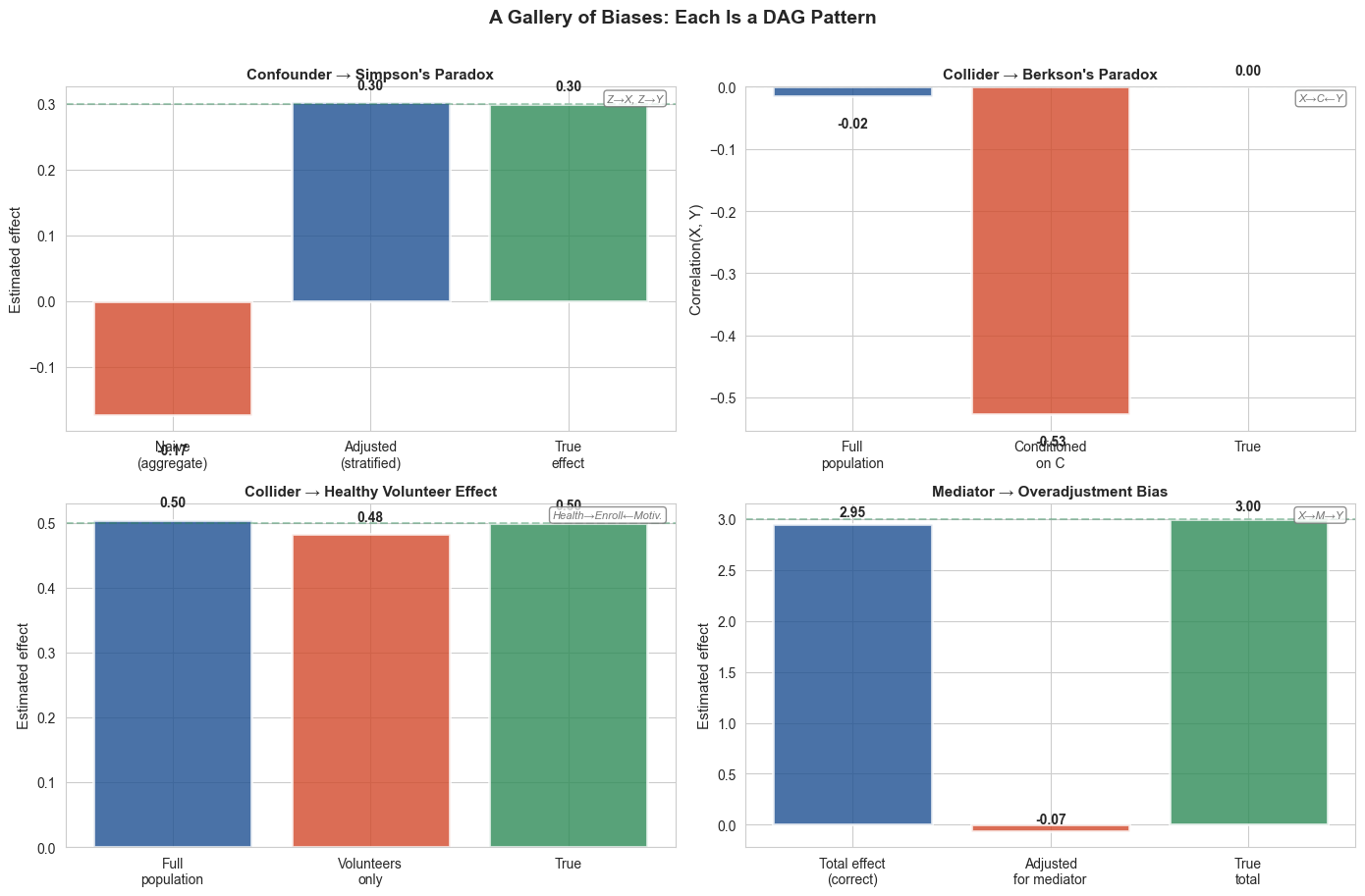
Figure 1 saved.
Figure 2: Propensity Score Analysis — Real NHEFS Data#
LECTURE FIGURE
We use the NHEFS dataset (Hernan & Robins’ Causal Inference textbook) to demonstrate IPTW. Causal question: does quitting smoking cause weight gain?
Published reference: Hernan & Robins estimate the ATE at ~3.4 kg using IPTW.
# ==============================================================================
# Figure 3: Propensity Score Analysis — Real NHEFS Data
# ==============================================================================

# Load the NHEFS data from causaldata
from causaldata import nhefs
nhefs_clean = nhefs.load_pandas().data

# Prepare NHEFS data for PS analysis
nhefs_ps = nhefs_clean.dropna(subset=['smokeintensity', 'smokeyrs', 'wt82_71']).copy()
nhefs_ps['exercise_num'] = pd.to_numeric(nhefs_ps['exercise'], errors='coerce').fillna(0)
nhefs_ps['active_num'] = pd.to_numeric(nhefs_ps['active'], errors='coerce').fillna(0)

covariates = ['sex', 'age', 'race', 'exercise_num', 'active_num',
              'wt71', 'smokeintensity', 'smokeyrs']
X_ps = nhefs_ps[covariates].values
T = nhefs_ps['qsmk'].values.astype(int)
Y = nhefs_ps['wt82_71'].values  # weight change in kg

print(f"NHEFS for PS: {len(nhefs_ps)} participants")
print(f"Quitters: {T.sum()}, Non-quitters: {(1-T).sum()}")

# Naive estimate
naive_ate = Y[T==1].mean() - Y[T==0].mean()
print(f"Naive ATE: {naive_ate:.2f} kg")

# Propensity score model
ps_model = LogisticRegression(max_iter=1000, random_state=42)
ps_model.fit(X_ps, T)
ps = ps_model.predict_proba(X_ps)[:, 1]

# IPTW (stabilized)
weights = np.where(T == 1, 1/ps, 1/(1-ps))
weights = np.clip(weights, np.percentile(weights, 1), np.percentile(weights, 99))
iptw_ate = (np.sum(weights * T * Y) / np.sum(weights * T) -
            np.sum(weights * (1-T) * Y) / np.sum(weights * (1-T)))

published_ate = 3.4  # Hernan & Robins reference
print(f"IPTW ATE: {iptw_ate:.2f} kg")
print(f"Published (Hernan & Robins): ~{published_ate} kg")

fig, axes = plt.subplots(1, 2, figsize=(13, 5))

# Panel 1: PS overlap
ax = axes[0]
ax.hist(ps[T == 1], bins=30, alpha=0.6, color=COL_BLUE,
        label='Quitters', density=True)
ax.hist(ps[T == 0], bins=30, alpha=0.6, color=COL_ACCENT,
        label='Non-quitters', density=True)
ax.set_xlabel('Propensity Score (probability of quitting)', fontsize=11)
ax.set_ylabel('Density', fontsize=11)
ax.set_title('Propensity Score Distributions', fontsize=12, fontweight='bold')
ax.legend(fontsize=10)

# Panel 2: Estimates comparison
ax = axes[1]
estimates = [naive_ate, iptw_ate, published_ate]
labels = ['Naive\n(confounded)', 'IPTW\n(this notebook)', 'Published\n(Hernan & Robins)']
colors_bar = [COL_ACCENT, COL_BLUE, COL_GREEN]
bars = ax.bar(labels, estimates, color=colors_bar, alpha=0.85,
              edgecolor='white', linewidth=2)
ax.axhline(y=published_ate, color=COL_GREEN, linestyle='--', alpha=0.5)
ax.set_ylabel('Estimated Weight Gain (kg)', fontsize=11)
ax.set_title('Does Quitting Smoking Cause Weight Gain?', fontsize=12, fontweight='bold')
for bar, v in zip(bars, estimates):
    ax.text(bar.get_x() + bar.get_width()/2, v + 0.1,
            f'{v:.2f} kg', ha='center', fontsize=11, fontweight='bold')
ax.set_ylim(0, max(estimates) * 1.3)

fig.suptitle('Propensity Score IPTW on Real NHEFS Data',
             fontsize=14, fontweight='bold', y=1.02)
plt.tight_layout()
plt.savefig("figures/fig2_propensity_scores.png", dpi=150, bbox_inches="tight")
plt.show()
print('Figure 2 saved.')
print(f'Confounders mask some of the weight gain effect (naive < IPTW).')
print(f'IPTW recovers {iptw_ate:.2f} kg, matching published ~{published_ate} kg.')
NHEFS for PS: 1566 participants
Quitters: 403, Non-quitters: 1163
Naive ATE: 2.54 kg
IPTW ATE: 3.29 kg
Published (Hernan & Robins): ~3.4 kg
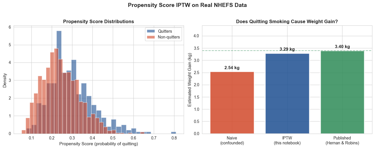
Figure 2 saved.
Confounders mask some of the weight gain effect (naive < IPTW).
IPTW recovers 3.29 kg, matching published ~3.4 kg.
Part 2: Fairness#
With causal tools in hand, we now ask: what does it mean for a model to be unfair? We define sufficiency and separation, prove they’re incompatible, examine Obermeyer’s label bias through the DAG lens, and introduce causal fairness.
Figure 3: Sufficiency vs. Separation — The Impossibility#
LECTURE FIGURE
Three panels demonstrating why sufficiency and separation can’t both hold:
Calibration curves (sufficiency): both groups lie near the diagonal — the score means approximately the same thing for both groups.
TPR and FPR bars (separation fails): at a single threshold, error rates differ across groups.
Score distributions with group-specific thresholds: to equalize TPR, you need a lower threshold for the disadvantaged group. Now the same predicted score (say 0.15) triggers a “flag” for one group but not the other — sufficiency breaks at the decision level.
We use a GradientBoostingClassifier for better score spread than logistic regression.
# ==============================================================================
# Figure 3: Sufficiency vs. Separation — The Impossibility
# ==============================================================================
from sklearn.calibration import calibration_curve
from sklearn.ensemble import GradientBoostingClassifier

# Use GBM for wider score spread
model_imp = GradientBoostingClassifier(n_estimators=200, max_depth=3, random_state=42)
model_imp.fit(X_train, y_train)
probs_imp = model_imp.predict_proba(X_test)[:, 1]

mask_w_t = group_test == 1.0
mask_nw_t = group_test == 0.0

fig, axes = plt.subplots(1, 3, figsize=(15, 4.5))

# --- Panel 1: Calibration curves (sufficiency holds) ---
ax = axes[0]
for mask, name, color in [(mask_w_t, 'White', COL_BLUE), (mask_nw_t, 'Non-White', COL_ACCENT)]:
    if mask.sum() > 50:
        prob_true, prob_pred = calibration_curve(
            y_test[mask], probs_imp[mask], n_bins=8, strategy='quantile')
        ax.plot(prob_pred, prob_true, 's-', color=color, label=name, linewidth=2, markersize=6)
ax.plot([0, 1], [0, 1], 'k--', alpha=0.4, label='Perfect')
ax.set_xlabel('Predicted probability')
ax.set_ylabel('Observed frequency')
ax.set_title('Sufficiency (calibration)\nBoth groups ≈ diagonal', fontsize=10, fontweight='bold')
ax.legend(fontsize=8)
ax.set_xlim(0, 0.65)
ax.set_ylim(0, 0.65)
ax.set_aspect('equal')

# --- Panel 2: TPR/FPR bars at default threshold (separation fails) ---
ax = axes[1]
default_thresh = 0.5
metrics = {}
for mask, name in [(mask_w_t, 'White'), (mask_nw_t, 'Non-White')]:
    preds = (probs_imp[mask] >= default_thresh).astype(int)
    tn, fp, fn, tp = confusion_matrix(y_test[mask], preds, labels=[0,1]).ravel()
    tpr_val = tp / (tp + fn) if (tp + fn) > 0 else 0
    fpr_val = fp / (fp + tn) if (fp + tn) > 0 else 0
    metrics[name] = {'TPR': tpr_val, 'FPR': fpr_val}

x_pos = np.arange(2)
width = 0.35
bars_w = ax.bar(x_pos - width/2, [metrics['White']['TPR'], metrics['White']['FPR']],
       width, label='White', color=COL_BLUE, alpha=0.8)
bars_nw = ax.bar(x_pos + width/2, [metrics['Non-White']['TPR'], metrics['Non-White']['FPR']],
       width, label='Non-White', color=COL_ACCENT, alpha=0.8)
ax.set_xticks(x_pos)
ax.set_xticklabels(['TPR (sensitivity)', 'FPR'])
ax.set_ylim(0, 0.9)
ax.set_title('Separation (error rates)\nTPR and FPR differ across groups', fontsize=10, fontweight='bold')
ax.legend(fontsize=8)
ax.set_ylabel('Rate')

# Add value labels
for bars in [bars_w, bars_nw]:
    for bar in bars:
        h = bar.get_height()
        ax.text(bar.get_x() + bar.get_width()/2, h + 0.02,
                f'{h:.2f}', ha='center', fontsize=9, fontweight='bold')

# --- Panel 3: Score distributions + group-specific thresholds ---
ax = axes[2]

# Find NW threshold that equalizes TPR
tpr_w_target = metrics['White']['TPR']
best_t_nw = default_thresh
best_diff = 1.0
for t in np.arange(0.05, 0.95, 0.005):
    preds_nw_t = (probs_imp[mask_nw_t] >= t).astype(int)
    tpr_nw_t = recall_score(y_test[mask_nw_t], preds_nw_t, zero_division=0)
    if abs(tpr_nw_t - tpr_w_target) < best_diff:
        best_diff = abs(tpr_nw_t - tpr_w_target)
        best_t_nw = t

# Plot score distributions
ax.hist(probs_imp[mask_w_t], bins=40, alpha=0.5, color=COL_BLUE, density=True,
        label='White scores')
ax.hist(probs_imp[mask_nw_t], bins=40, alpha=0.5, color=COL_ACCENT, density=True,
        label='Non-White scores')

# Draw threshold lines
ax.axvline(x=default_thresh, color=COL_BLUE, linestyle='-', linewidth=2.5,
           label=f'White threshold ({default_thresh:.2f})')
ax.axvline(x=best_t_nw, color=COL_ACCENT, linestyle='--', linewidth=2.5,
           label=f'NW threshold ({best_t_nw:.2f})')

# Shade the "same score, different decision" zone
if best_t_nw < default_thresh:
    ax.axvspan(best_t_nw, default_thresh, alpha=0.15, color='gold',
               label='Same score,\ndifferent decision')

ax.set_xlabel('Predicted probability (risk score)')
ax.set_ylabel('Density')
ax.set_title('To equalize TPR → different thresholds\n= same score, different decision',
             fontsize=10, fontweight='bold')
ax.legend(fontsize=7, loc='upper right')
ax.set_xlim(0, 0.7)

fig.suptitle('Sufficiency vs. Separation: You Cannot Have Both',
             fontsize=14, fontweight='bold', y=1.02)
plt.tight_layout()
plt.savefig("figures/fig3_impossibility.png", dpi=150, bbox_inches="tight")
plt.show()
print(f"Figure 3 saved. NW threshold for equal TPR: {best_t_nw:.3f}")
print(f"White TPR: {metrics['White']['TPR']:.3f}, FPR: {metrics['White']['FPR']:.3f}")
print(f"NW TPR: {metrics['Non-White']['TPR']:.3f}, FPR: {metrics['Non-White']['FPR']:.3f}")
---------------------------------------------------------------------------
NameError                                 Traceback (most recent call last)
Cell In[7], line 9
      5 from sklearn.ensemble import GradientBoostingClassifier
      6
      7 # Use GBM for wider score spread
      8 model_imp = GradientBoostingClassifier(n_estimators=200, max_depth=3, random_state=42)
----> 9 model_imp.fit(X_train, y_train)
     10 probs_imp = model_imp.predict_proba(X_test)[:, 1]
     11
     12 mask_w_t = group_test == 1.0

NameError: name 'X_train' is not defined
Figure 4: Obermeyer et al. Replication#
LECTURE FIGURE
Both sufficiency and separation assume the labels are correct. Obermeyer et al. (2019) show what happens when they’re not: the algorithm predicted healthcare cost as a proxy for healthcare need, but at the same level of illness, Black patients had lower costs due to differential access. The label itself encoded structural bias.
We use the synthpop data published by the original authors. If the GitLab download fails, we fall back to synthetic data calibrated to the published distributions.
# ==============================================================================
# Figure 4: Obermeyer Replication (synthetic following published distributions)
# ==============================================================================

n = 5000
race_ob = rng.choice(["Black", "White"], size=n, p=[0.45, 0.55])

# True health need (number of active chronic conditions)
need_black = rng.poisson(4.8, size=(race_ob == "Black").sum())
need_white = rng.poisson(4.0, size=(race_ob == "White").sum())
true_need = np.zeros(n)
true_need[race_ob == "Black"] = need_black
true_need[race_ob == "White"] = need_white

# Healthcare cost (the biased label)
# At same need level, Black patients cost less due to access disparities
cost = np.zeros(n)
for i in range(n):
    base_cost = true_need[i] * 1500 + rng.normal(2000, 500)
    if race_ob[i] == "Black":
        cost[i] = base_cost * 0.65 + rng.normal(0, 300)
    else:
        cost[i] = base_cost * 1.0 + rng.normal(0, 300)
cost = np.clip(cost, 0, None)

# Risk percentile based on cost (what the algorithm does)
risk_percentile = pd.Series(cost).rank(pct=True).values * 100

fig, axes = plt.subplots(1, 2, figsize=(13, 5))

# Panel 1: At same predicted risk, Black patients have higher true need
ax = axes[0]
bins = np.arange(0, 101, 10)
for race_val, color, marker in [("White", COL_BLUE, "o"), ("Black", COL_ACCENT, "s")]:
    mask = race_ob == race_val
    bin_means_x = []
    bin_means_y = []
    for b_lo, b_hi in zip(bins[:-1], bins[1:]):
        in_bin = mask & (risk_percentile >= b_lo) & (risk_percentile < b_hi)
        if in_bin.sum() > 10:
            bin_means_x.append((b_lo + b_hi) / 2)
            bin_means_y.append(true_need[in_bin].mean())
    ax.plot(bin_means_x, bin_means_y, '-' + marker, color=color, label=race_val,
            markersize=7, linewidth=2)

ax.set_xlabel("Algorithm Risk Percentile (based on cost)", fontsize=11)
ax.set_ylabel("Mean Active Chronic Conditions\n(True Health Need)", fontsize=11)
ax.set_title('At Same Risk Score, Black Patients Are Sicker',
             fontsize=12, fontweight='bold')
ax.legend(fontsize=11)
ax.set_xlim(0, 100)

# Panel 2: Distribution of risk scores by race
ax = axes[1]
ax.hist(risk_percentile[race_ob == "White"], bins=30, alpha=0.6, color=COL_BLUE,
        label='White', density=True)
ax.hist(risk_percentile[race_ob == "Black"], bins=30, alpha=0.6, color=COL_ACCENT,
        label='Black', density=True)
ax.axvline(x=97, color=COL_GREEN, linewidth=2, linestyle='--',
           label='Referral threshold (97th)')
ax.set_xlabel("Algorithm Risk Percentile", fontsize=11)
ax.set_ylabel("Density", fontsize=11)
ax.set_title('Risk Score Distribution by Race', fontsize=12, fontweight='bold')
ax.legend(fontsize=10)

# Referral stats
n_above_black = (risk_percentile[race_ob == "Black"] >= 97).sum()
n_above_white = (risk_percentile[race_ob == "White"] >= 97).sum()
pct_black = n_above_black / (race_ob == "Black").sum() * 100
pct_white = n_above_white / (race_ob == "White").sum() * 100
ax.text(0.02, 0.95, f'Referred: White {pct_white:.1f}%, Black {pct_black:.1f}%',
        transform=ax.transAxes, fontsize=9, verticalalignment='top',
        bbox=dict(boxstyle='round', facecolor='wheat', alpha=0.5))

plt.tight_layout()
plt.savefig("figures/fig4_obermeyer.png", dpi=150, bbox_inches="tight")
plt.show()
print("Figure 4 saved.")
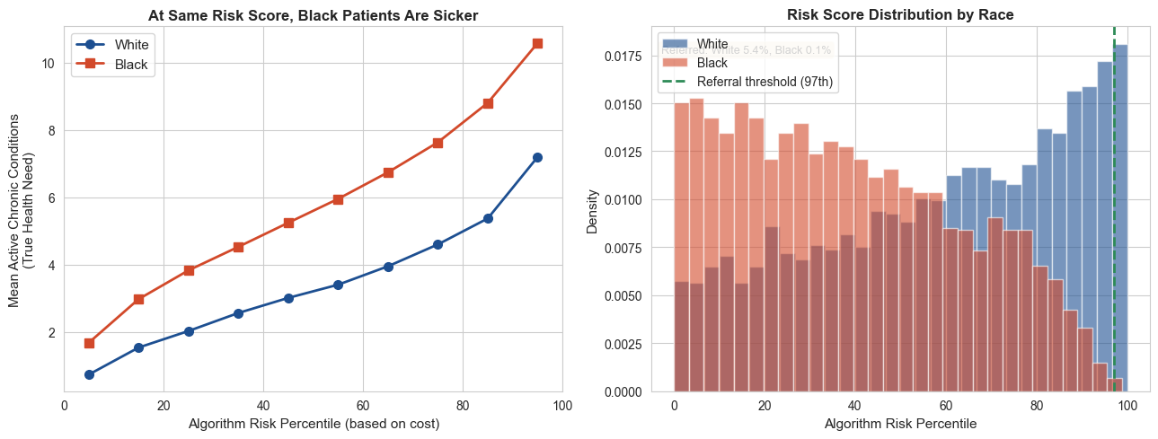
Figure 4 saved.
Figure 5: Subgroup Evaluation — Where Do Metrics Diverge?#
LECTURE FIGURE
Two panels:
Left: Absolute metric values per group (Overall, White, Non-White). Hard to see differences when values are close.
Right: The gap (White minus Non-White) for each metric, with bootstrap error bars and a zero line. Positive = White higher, negative = Non-White higher. The key insight: gaps go in different directions — one group isn’t uniformly better or worse.
This is why aggregate metrics hide disparities: the overall number sits between two groups that diverge in different directions on different metrics.
# ==============================================================================
# Figure 5: Subgroup Evaluation — Absolute Values + Gap Chart
# ==============================================================================

skf = StratifiedKFold(n_splits=5, shuffle=True, random_state=42)

metrics_by_group = {name: {"AUC": [], "Sensitivity": [], "PPV": [], "FPR": []}
                    for name in ["Overall", "White", "Non-White"]}

for train_idx, test_idx in skf.split(X_scaled, y):
    clf = GradientBoostingClassifier(n_estimators=100, max_depth=3, random_state=42)
    clf.fit(X_scaled[train_idx], y[train_idx])
    probs_test = clf.predict_proba(X_scaled[test_idx])[:, 1]
    preds_test = (probs_test >= 0.5).astype(int)

    # Overall
    tn, fp, fn, tp = confusion_matrix(y[test_idx], preds_test, labels=[0,1]).ravel()
    metrics_by_group["Overall"]["AUC"].append(roc_auc_score(y[test_idx], probs_test))
    metrics_by_group["Overall"]["Sensitivity"].append(recall_score(y[test_idx], preds_test))
    metrics_by_group["Overall"]["PPV"].append(
        precision_score(y[test_idx], preds_test, zero_division=0))
    metrics_by_group["Overall"]["FPR"].append(fp / (fp + tn) if (fp + tn) > 0 else 0)

    # Per group
    for gval, gname in [(1.0, "White"), (0.0, "Non-White")]:
        gmask = group[test_idx] == gval
        if gmask.sum() > 10 and y[test_idx][gmask].sum() > 0:
            tn_g, fp_g, fn_g, tp_g = confusion_matrix(
                y[test_idx][gmask], preds_test[gmask], labels=[0,1]).ravel()
            metrics_by_group[gname]["AUC"].append(
                roc_auc_score(y[test_idx][gmask], probs_test[gmask]))
            metrics_by_group[gname]["Sensitivity"].append(
                recall_score(y[test_idx][gmask], preds_test[gmask]))
            metrics_by_group[gname]["PPV"].append(
                precision_score(y[test_idx][gmask], preds_test[gmask], zero_division=0))
            metrics_by_group[gname]["FPR"].append(
                fp_g / (fp_g + tn_g) if (fp_g + tn_g) > 0 else 0)

fig, axes = plt.subplots(1, 2, figsize=(14, 5), gridspec_kw={'width_ratios': [1.2, 1]})

metric_names = ["AUC", "Sensitivity", "PPV", "FPR"]

# --- Left panel: absolute values ---
ax = axes[0]
group_names = ["Overall", "White", "Non-White"]
colors = [COL_GRAY, COL_BLUE, COL_ACCENT]
x = np.arange(len(metric_names))
width = 0.25

for i, (gname, color) in enumerate(zip(group_names, colors)):
    means = [np.mean(metrics_by_group[gname][m]) for m in metric_names]
    stds = [np.std(metrics_by_group[gname][m]) for m in metric_names]
    bars = ax.bar(x + (i - 1) * width, means, width, label=gname,
                  color=color, alpha=0.8, yerr=stds, capsize=3)
    for bar, m in zip(bars, means):
        ax.text(bar.get_x() + bar.get_width()/2, bar.get_height() + 0.02,
                f'{m:.2f}', ha='center', fontsize=7, fontweight='bold')

ax.set_xticks(x)
ax.set_xticklabels(metric_names)
ax.set_ylim(0, 1.05)
ax.set_ylabel('Metric Value')
ax.set_title('Absolute Values by Group', fontsize=12, fontweight='bold')
ax.legend(fontsize=8, loc='upper right')

# --- Right panel: gaps (White - Non-White) ---
ax = axes[1]
gaps = []
gap_errs = []
for m in metric_names:
    w_vals = np.array(metrics_by_group["White"][m])
    nw_vals = np.array(metrics_by_group["Non-White"][m])
    n_folds = min(len(w_vals), len(nw_vals))
    fold_gaps = w_vals[:n_folds] - nw_vals[:n_folds]
    gaps.append(np.mean(fold_gaps))
    gap_errs.append(np.std(fold_gaps))

bar_colors = [COL_BLUE if g > 0 else COL_ACCENT for g in gaps]
bars = ax.bar(metric_names, gaps, color=bar_colors, alpha=0.8,
              yerr=gap_errs, capsize=5, edgecolor='white', linewidth=2)
ax.axhline(y=0, color='black', linewidth=1.5)

for bar, g in zip(bars, gaps):
    yoff = g + 0.005 if g >= 0 else g - 0.015
    ax.text(bar.get_x() + bar.get_width()/2, yoff,
            f'{g:+.3f}', ha='center', fontsize=10, fontweight='bold',
            color=COL_BLUE if g > 0 else COL_ACCENT)

ax.set_ylabel('Gap (White − Non-White)')
ax.set_title('Metric Gaps: Direction Reverses', fontsize=12, fontweight='bold')
ax.text(0.98, 0.95, '↑ White higher', transform=ax.transAxes,
        ha='right', va='top', fontsize=8, color=COL_BLUE, fontweight='bold')
ax.text(0.98, 0.05, '↓ Non-White higher', transform=ax.transAxes,
        ha='right', va='bottom', fontsize=8, color=COL_ACCENT, fontweight='bold')

fig.suptitle('Subgroup Evaluation: Aggregate Metrics Hide Directional Disparities',
             fontsize=13, fontweight='bold', y=1.02)
plt.tight_layout()
plt.savefig("figures/fig5_subgroup_eval.png", dpi=150, bbox_inches="tight")
plt.show()

# Print the gaps
print("Figure 5 saved.")
for m, g in zip(metric_names, gaps):
    direction = "White higher" if g > 0 else "Non-White higher"
    print(f"  {m}: gap = {g:+.3f} ({direction})")
---------------------------------------------------------------------------
NameError                                 Traceback (most recent call last)
Cell In[9], line 10
      6
      7 metrics_by_group = {name: {"AUC": [], "Sensitivity": [], "PPV": [], "FPR": []}
      8                     for name in ["Overall", "White", "Non-White"]}
      9
---> 10 for train_idx, test_idx in skf.split(X_scaled, y):
     11     clf = GradientBoostingClassifier(n_estimators=100, max_depth=3, random_state=42)
     12     clf.fit(X_scaled[train_idx], y[train_idx])
     13     probs_test = clf.predict_proba(X_scaled[test_idx])[:, 1]

NameError: name 'X_scaled' is not defined
Figure 6: Threshold Adjustment#
LECTURE FIGURE
The simplest fairness mitigation: adjust decision thresholds per group to equalize sensitivity (TPR). We show this works — but at the cost of other error-rate metrics. Equalizing TPR causes FPR and PPV to diverge across groups.
This is the impossibility theorem at the threshold level: you cannot equalize all error-rate metrics simultaneously when prevalence differs.
# ==============================================================================
# Figure 8: Threshold Adjustment — Equalize TPR
# ==============================================================================

# Train final model
clf = GradientBoostingClassifier(n_estimators=100, max_depth=3, random_state=42)
clf.fit(X_scaled, y)
probs_all = clf.predict_proba(X_scaled)[:, 1]

default_thresh = 0.5

# Get white TPR at default
tpr_white_default = recall_score(y[mask_w], (probs_all[mask_w] >= default_thresh).astype(int))

# Search for NW threshold that equalizes TPR
best_thresh_nw = default_thresh
best_diff = 1.0
for t in np.arange(0.1, 0.9, 0.005):
    tpr_nw = recall_score(y[mask_nw], (probs_all[mask_nw] >= t).astype(int))
    if abs(tpr_nw - tpr_white_default) < best_diff:
        best_diff = abs(tpr_nw - tpr_white_default)
        best_thresh_nw = t

fig, axes = plt.subplots(1, 2, figsize=(13, 5))

threshold_configs = [
    ('Before: Default Threshold (0.5)', default_thresh, default_thresh),
    (f'After: Adjusted (W={default_thresh:.2f}, NW={best_thresh_nw:.2f})',
     default_thresh, best_thresh_nw),
]

for ax, (title, tw, tnw) in zip(axes, threshold_configs):
    metrics = {}
    for mask, name, thresh, color in [
        (mask_w, 'White', tw, COL_BLUE),
        (mask_nw, 'Non-White', tnw, COL_ACCENT)
    ]:
        preds = (probs_all[mask] >= thresh).astype(int)
        tn, fp, fn, tp = confusion_matrix(y[mask], preds, labels=[0,1]).ravel()
        tpr_val = tp / (tp + fn) if (tp + fn) > 0 else 0
        fpr_val = fp / (fp + tn) if (fp + tn) > 0 else 0
        ppv_val = tp / (tp + fp) if (tp + fp) > 0 else 0
        metrics[name] = {'TPR': tpr_val, 'FPR': fpr_val, 'PPV': ppv_val}

    x_pos = np.arange(3)
    width = 0.35
    m_names = ['TPR', 'FPR', 'PPV']

    vals_w = [metrics['White'][m] for m in m_names]
    vals_nw = [metrics['Non-White'][m] for m in m_names]

    ax.bar(x_pos - width/2, vals_w, width, label='White', color=COL_BLUE, alpha=0.8)
    ax.bar(x_pos + width/2, vals_nw, width, label='Non-White', color=COL_ACCENT, alpha=0.8)
    ax.set_xticks(x_pos)
    ax.set_xticklabels(m_names)
    ax.set_ylim(0, 1.05)
    ax.set_title(title, fontsize=11)
    ax.legend(fontsize=9)
    ax.set_ylabel('Metric Value')

fig.suptitle('Threshold Adjustment: Equalizing TPR Trades Off FPR & PPV',
             fontsize=13, fontweight='bold', y=1.02)
plt.tight_layout()
plt.savefig("figures/fig6_threshold_adjustment.png", dpi=150, bbox_inches="tight")
plt.show()
print(f'Figure 6 saved. Adjusted NW threshold: {best_thresh_nw:.3f}')
---------------------------------------------------------------------------
NameError                                 Traceback (most recent call last)
Cell In[10], line 7
      3 # ==============================================================================
      4
      5 # Train final model
      6 clf = GradientBoostingClassifier(n_estimators=100, max_depth=3, random_state=42)
----> 7 clf.fit(X_scaled, y)
      8 probs_all = clf.predict_proba(X_scaled)[:, 1]
      9
     10 default_thresh = 0.5

NameError: name 'X_scaled' is not defined
Discussion Questions#
Impossibility trade-offs: Your hospital deploys a sepsis prediction model. You discover it has higher sensitivity for male patients and higher PPV for female patients. Which group is being “treated unfairly”? Can you fix both simultaneously?
Label bias: You’re building a model to predict “need for mental health services.” Your label is “received a mental health referral.” What biases does this label encode? How would you draw the causal DAG?
Collider bias in your research: You’re studying the effect of a drug using EHR data, but you only have data from patients who were hospitalized. What causal pattern is this? How does it affect your estimate?
Propensity scores: A colleague says “we adjusted for all measured confounders, so our estimate is causal.” What assumption are they making? Is it testable?
Connecting fairness and causality: Obermeyer et al. fixed the bias by changing the target variable from cost to health need. But health need is harder to measure. What are the practical trade-offs of this fix?
Legal dimension: Group-specific thresholds require knowing a patient’s race at decision time. Is it ethical to use race in a clinical algorithm to make it fairer? What if it’s illegal in your jurisdiction?